Documentation
Feedback
Guides
Learning Center

Learning Center
Learning Center
Linking an app and using it on a store's theme
View in Portuguese
This content was migrated from the VTEX Learning Center and is no longer being actively maintained. For the most accurate and up-to-date information, please check the official documentation.

Introduction

Since you're already familiar with Store Framework, you know that we use blocks, like shelf and sku-selector, to create a VTEX IO store. In this step, you're going to create a block that is going to be used in your store's home page theme.

Adding a dummy text to our component

  1. In the local template cloned, open up the Countdown.tsx file. You will see that it contains a template implementation of a React component, which is an empty div, as shown below:


    _17
    //react/Countdown.tsx
    _17
    import React from 'react'
    _17
    _17
    interface CountdownProps {}
    _17
    _17
    const Countdown: StorefrontFunctionComponent<CountdownProps> = ({}) => {
    _17
    return <div></div>
    _17
    }
    _17
    _17
    Countdown.schema = {
    _17
    title: 'editor.countdown.title',
    _17
    description: 'editor.countdown.description',
    _17
    type: 'object',
    _17
    properties: {},
    _17
    }
    _17
    _17
    export default Countdown

    Some things to pay attention:

    • The typings for the component props are defined in here:


      _10
      interface CountdownProps {}

    • This schema refers to the content that it's shown in the Site Editor:


      _10
      Countdown.schema = {
      _10
      title: 'editor.countdown.title',
      _10
      description: 'editor.countdown.description',
      _10
      type: 'object',
      _10
      properties: {},
      _10
      }

    In order for your block to accept user customizations, you need to export a schema in the React component responsible for the block using JSON schema. This will, automatically, generate a form in Site Editor linked to the block that you're developing.

  2. Now, let's add a h1 tag inside the component.


    _10
    const Countdown: StorefrontFunctionComponent<CountdownProps> = ({}) => {
    _10
    - return <div></div>
    _10
    + return (
    _10
    + <div>
    _10
    + <h1>Countdown Test</h1>
    _10
    + </div>
    _10
    + )
    _10
    }

  3. Now, in order to see the block that you've just created, it's necessary for you to declare the block that the app defines in a theme.

    Which theme should I use?

    In case of already having a theme from the previous courses, you can use it. However, if you do not have one, you can use vtex.store-theme, which can be cloned by running this command in your terminal.


    _10
    git clone https://github.com/vtex-apps/store-theme.git

    Note: It can be cloned in a folder of your preference, but not inside the app's directory that you're developing.

    Now, to avoid conflicts, go to your terminal and unlink any theme or apps you have linked


    _10
    vtex unlink --all

    With both repositories ready to go, one need to link both, in two different terminals, using the following command:


    _10
    vtex link

    Remember to use your own workspace!

  1. With both links active (theme and custom block), let's add the block into the theme. To do that, it's necessary to add it in the theme's dependencies:


    _10
    {
    _10
    ...
    _10
    "dependencies": {
    _10
    ...
    _10
    + "vtex.countdown": "0.x",
    _10
    ...
    _10
    },
    _10
    ...
    _10
    }

  2. And lastly, we do want to add the block to the store, in order for it to be seen. Inside the file store-theme/store/blocks/home/home.jsonc, declare countdown block:


    _10
    {
    _10
    "store.home": {
    _10
    "blocks": [
    _10
    + "countdown",
    _10
    ...
    _10
    ]
    _10
    ...
    _10
    }
    _10
    ...
    _10
    }

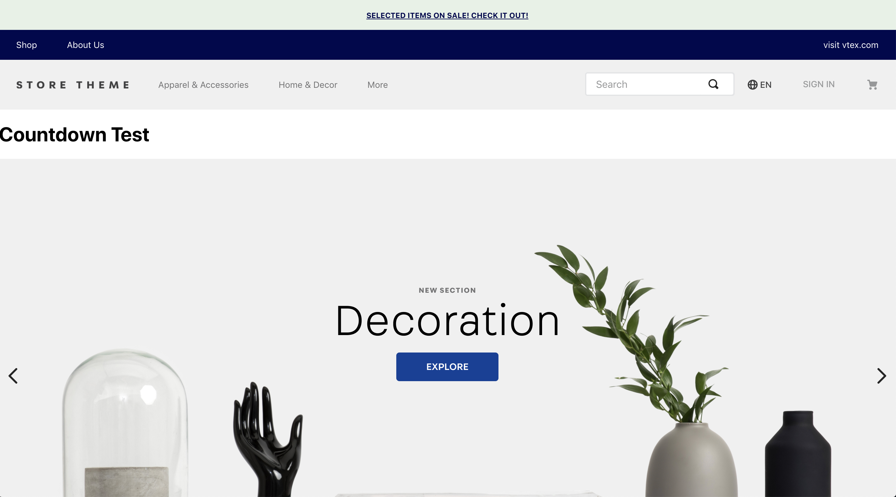
The expected result is to find a h1 in the top of the store, you can see it below:

{"base64":"  ","img":{"width":2876,"height":1596,"type":"png","mime":"image/png","wUnits":"px","hUnits":"px","length":1066353,"url":"https://user-images.githubusercontent.com/19495917/80492927-0e0c8a00-893b-11ea-8a1d-aaad2874a014.png"}}

In case of adding the block as the last one on the store.home, you're going to see it in the bottom of the page.


Answer sheet

See answer sheet for Countdown.tsx
Countdown.tsx

_21
// store-block/react/Countdown.tsx
_21
import React from 'react'
_21
_21
interface CountdownProps {}
_21
_21
const Countdown: StorefrontFunctionComponent<CountdownProps> = ({}) => {
_21
return (
_21
<div>
_21
<h1>Teste Countdown</h1>
_21
</div>
_21
)
_21
}
_21
_21
Countdown.schema = {
_21
title: 'editor.countdown.title',
_21
description: 'editor.countdown.description',
_21
type: 'object',
_21
properties: {},
_21
}
_21
_21
export default Countdown

See answer sheet for home.jsonc
home.jsonc

_108
// store-theme/store/blocks/home/home.jsonc
_108
{
_108
"store.home": {
_108
"blocks": [
_108
"countdown",
_108
"list-context.image-list#demo",
_108
"__fold__.mobile",
_108
"flex-layout.row#deals",
_108
"__fold__.desktop",
_108
"rich-text#shelf-title",
_108
"flex-layout.row#shelf",
_108
"info-card#home",
_108
"rich-text#question",
_108
"rich-text#link",
_108
"newsletter"
_108
]
_108
},
_108
_108
"shelf#home": {
_108
"blocks": ["product-summary.shelf"]
_108
},
_108
_108
"list-context.image-list#demo": {
_108
"children": ["slider-layout#demo-images"],
_108
"props": {
_108
"height": 720,
_108
"images": [
_108
{
_108
"image": "https://storecomponents.vteximg.com.br/arquivos/banner-principal.png",
_108
"mobileImage": "https://storecomponents.vteximg.com.br/arquivos/banner-principal-mobile.jpg"
_108
},
_108
{
_108
"image": "https://storecomponents.vteximg.com.br/arquivos/banner.jpg",
_108
"mobileImage": "https://storecomponents.vteximg.com.br/arquivos/banner-principal-mobile.jpg"
_108
}
_108
]
_108
}
_108
},
_108
"slider-layout#demo-images": {
_108
"props": {
_108
"itemsPerPage": {
_108
"desktop": 1,
_108
"tablet": 1,
_108
"phone": 1
_108
},
_108
"infinite": true,
_108
"showNavigationArrows": "desktopOnly",
_108
"blockClass": "carousel"
_108
}
_108
},
_108
_108
"rich-text#shelf-title": {
_108
"props": {
_108
"text": "## Summer",
_108
"blockClass": "shelfTitle"
_108
}
_108
},
_108
"flex-layout.row#shelf": {
_108
"children": ["list-context.product-list#demo1"]
_108
},
_108
"list-context.product-list#demo1": {
_108
"blocks": ["product-summary.shelf"],
_108
"children": ["slider-layout#demo-products"],
_108
"props": {
_108
"orderBy": "OrderByTopSaleDESC"
_108
}
_108
},
_108
"slider-layout#demo-products": {
_108
"props": {
_108
"itemsPerPage": {
_108
"desktop": 5,
_108
"tablet": 3,
_108
"phone": 1
_108
},
_108
"infinite": true,
_108
"fullWidth": true,
_108
"blockClass": "shelf"
_108
}
_108
},
_108
_108
"info-card#home": {
_108
"props": {
_108
"id": "info-card-home",
_108
"isFullModeStyle": false,
_108
"textPosition": "left",
_108
"imageUrl": "https://storecomponents.vteximg.com.br/arquivos/banner-infocard2.png",
_108
"headline": "Clearance Sale",
_108
"callToActionText": "DISCOVER",
_108
"callToActionUrl": "/sale/d",
_108
"blockClass": "info-card-home",
_108
"textAlignment": "center"
_108
}
_108
},
_108
_108
"rich-text#question": {
_108
"props": {
_108
"text": "**This is an example store built using the VTEX platform.\nWant to know more?**",
_108
"blockClass": "question"
_108
}
_108
},
_108
_108
"rich-text#link": {
_108
"props": {
_108
"text": "\n**Reach us at**\nwww.vtex.com.br",
_108
"blockClass": "link"
_108
}
_108
}
_108
}

See answer sheet for manifest.json
manifest.json

_59
// store-theme/manifest.json
_59
{
_59
"vendor": "vtex",
_59
"name": "store-theme",
_59
"version": "3.30.1",
_59
"builders": {
_59
"styles": "2.x",
_59
"store": "0.x",
_59
"sitemap": "0.x",
_59
"docs": "0.x"
_59
},
_59
"mustUpdateAt": "2018-09-05",
_59
"scripts": {
_59
"postreleasy": "vtex publish --verbose"
_59
},
_59
"dependencies": {
_59
"vtex.store": "2.x",
_59
"vtex.store-header": "2.x",
_59
"vtex.product-summary": "2.x",
_59
"vtex.store-footer": "2.x",
_59
"vtex.store-components": "3.x",
_59
"vtex.styleguide": "9.x",
_59
"vtex.slider": "0.x",
_59
"vtex.carousel": "2.x",
_59
"vtex.shelf": "1.x",
_59
"vtex.menu": "2.x",
_59
"vtex.minicart": "2.x",
_59
"vtex.product-details": "1.x",
_59
"vtex.product-kit": "1.x",
_59
"vtex.search-result": "3.x",
_59
"vtex.login": "2.x",
_59
"vtex.my-account": "1.x",
_59
"vtex.flex-layout": "0.x",
_59
"vtex.rich-text": "0.x",
_59
"vtex.store-drawer": "0.x",
_59
"vtex.locale-switcher": "0.x",
_59
"vtex.product-quantity": "1.x",
_59
"vtex.product-identifier": "0.x",
_59
"vtex.breadcrumb": "1.x",
_59
"vtex.sticky-layout": "0.x",
_59
"vtex.product-customizer": "2.x",
_59
"vtex.stack-layout": "0.x",
_59
"vtex.product-specification-badges": "0.x",
_59
"vtex.product-review-interfaces": "1.x",
_59
"vtex.telemarketing": "2.x",
_59
"vtex.order-placed": "1.x",
_59
"vtex.checkout-summary": "0.x",
_59
"vtex.product-list": "0.x",
_59
"vtex.add-to-cart-button": "0.x",
_59
"vtex.product-bookmark-interfaces": "1.x",
_59
"vtex.slider-layout": "0.x",
_59
"vtex.store-image": "0.x",
_59
"vtex.store-icons": "0.x",
_59
"vtex.modal-layout": "0.x",
_59
"vtex.store-link": "0.x",
_59
"vtex.countdown": "0.x"
_59
},
_59
"$schema": "https://raw.githubusercontent.com/vtex/node-vtex-api/master/gen/manifest.schema"
_59
}

On this page